As a means to unify all building assets within the BC Interior health authority’s scope, a policy to standardize interior signage was developed and secured into a branding manual in two forms: as a standalone guide detailing all aspects of signage, from project rationales to sign installation; and as an element within IH’s overall strategic identity package.

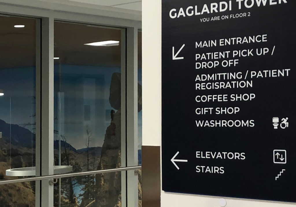
Colour was selected by taking IH’s four branded colours and placing them within a high-contrast scheme; modelling the simple directness of black and white, while bringing softness and warmth to a clinical environment.