A landmark signage policy was developed to connect and highlight a broad range of cultural and historical assets throughout the City. The signage structure identifies sites and their historical context, while accepting inserts conveying up-to-date information such as public announcements.

The project aim was to create an accessible, playful and enduring signage system. The design draws from Kamloops’ spectacular natural setting, cultural heritage and industrial history.

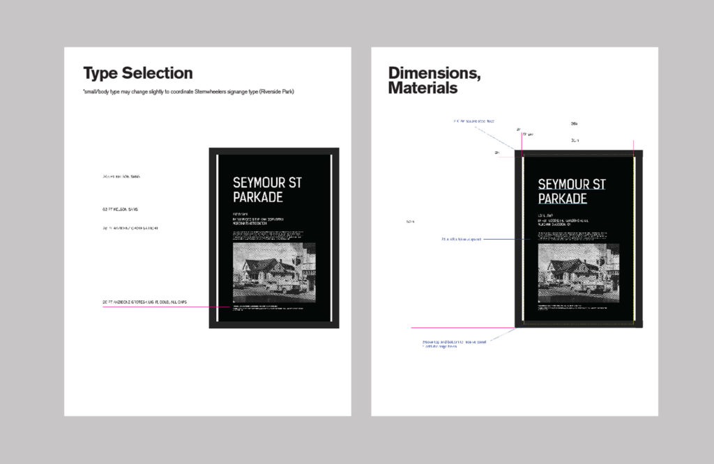
The design aim is to appear sturdy and playful enough to stand out but transparent enough to fade into the background. The size corresponds to legibility as well, allowing content to be transmitted quickly and easily to a range of readers.


The main display typeface is an industrially–inspired sans serif with distinctive ornamental curves. It conveys information unambiguously, but is softened by features that reference the landscape. The font is repeated through a range of sign applications with the intention of creating a unique sense of place.


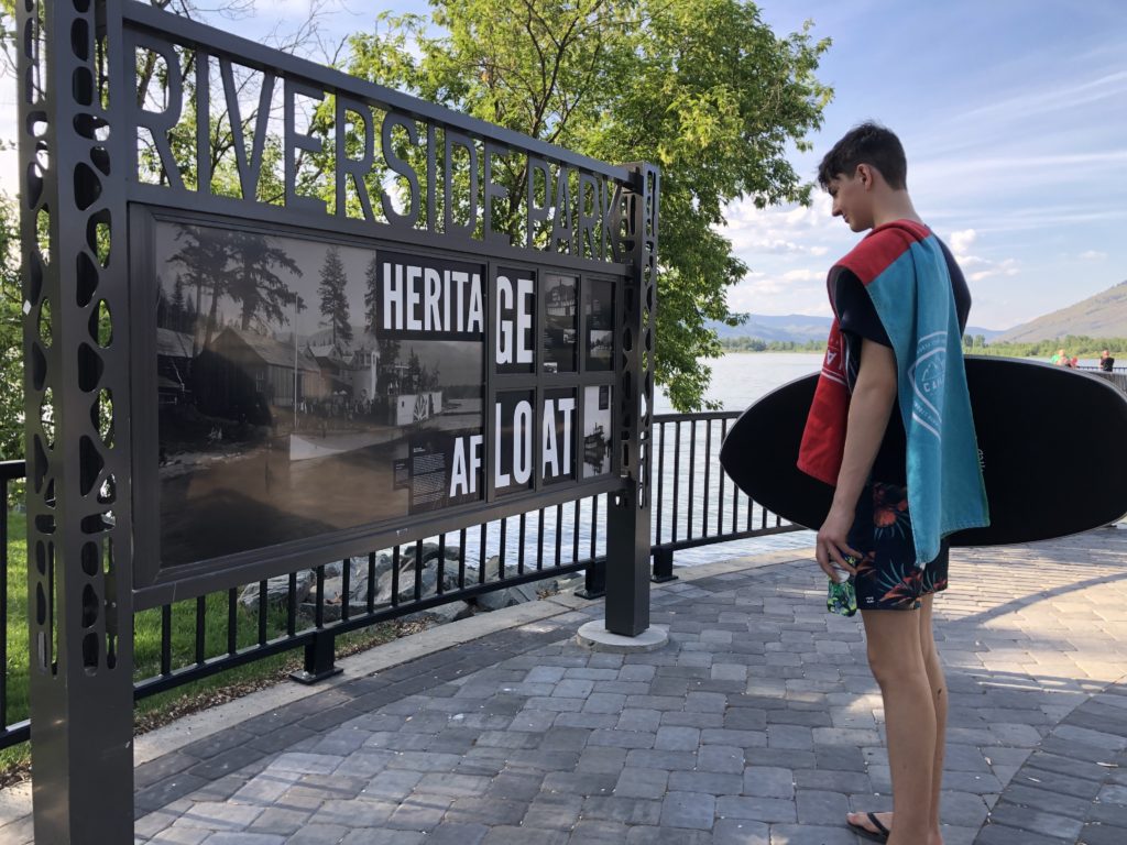
Ideas that informed the type selection translate into the signage structure. Garden–lattice styled painted steel posts are inspired by the structural members of the Red Bridge, the Arts & Crafts movement and the park lands of Kamloops. The local influence and material proportions allow the supports to be robust without feeling overpowering.


The simplicity of the design and its overall reference to Kamloops makes it adaptable enough to accommodate a range of City of Kamloops Park and Culture assets. Moreover, it is capable of working fluidly across a range of the City’s diverse branding initiatives.