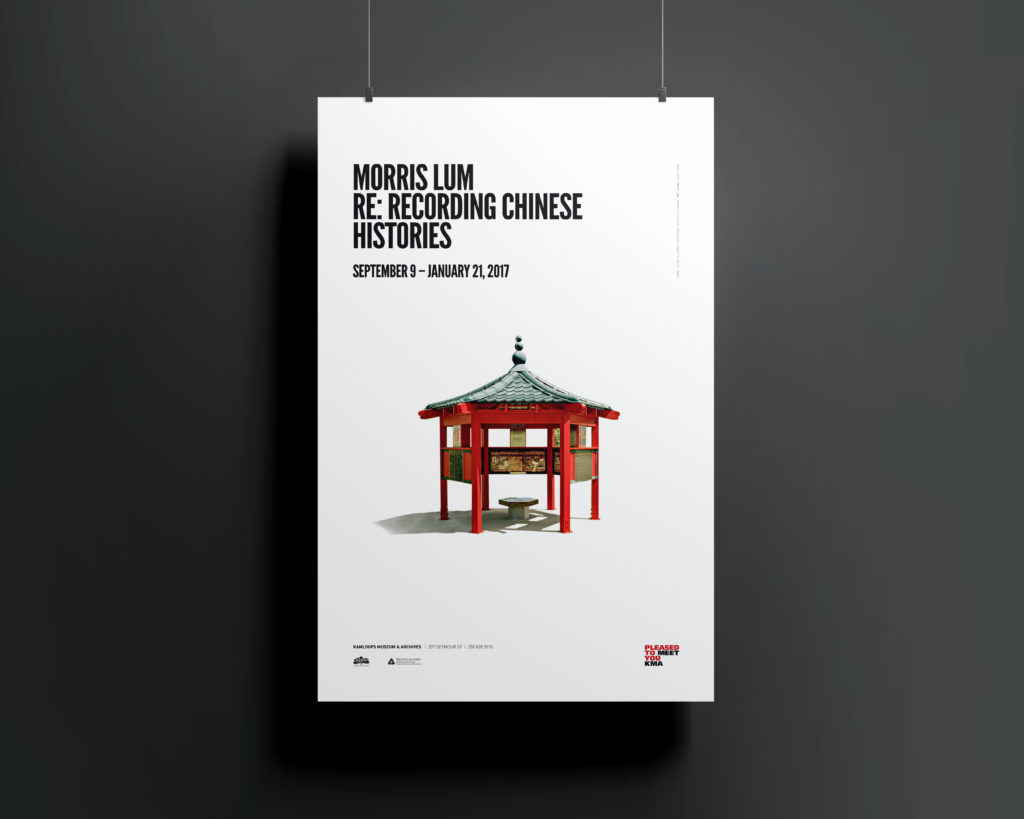
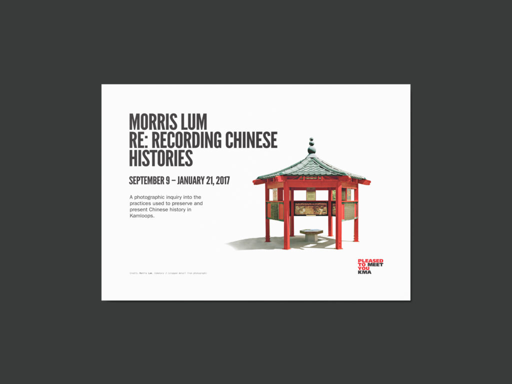
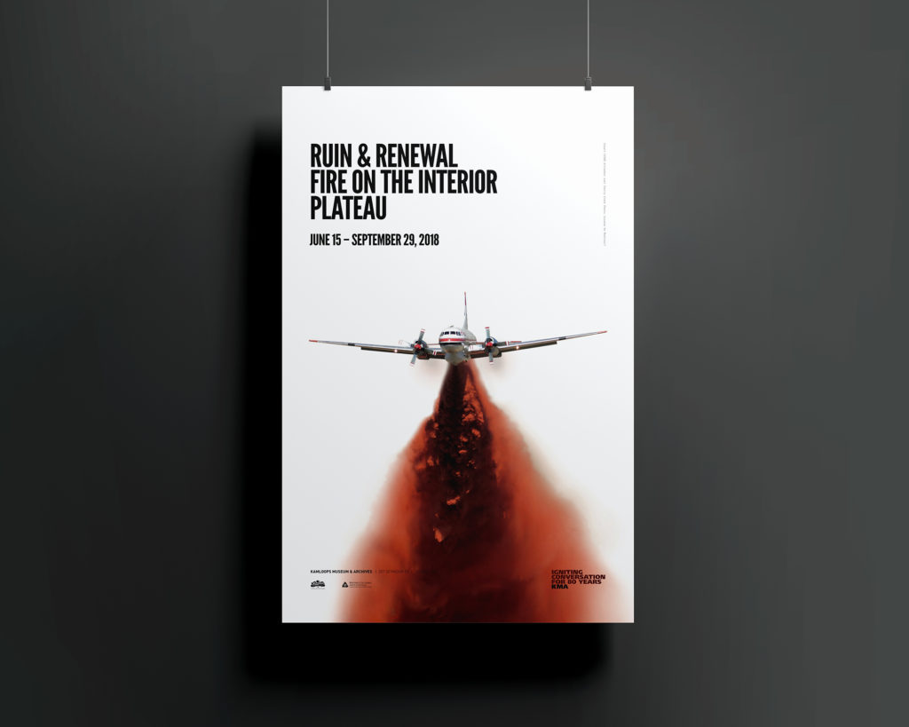
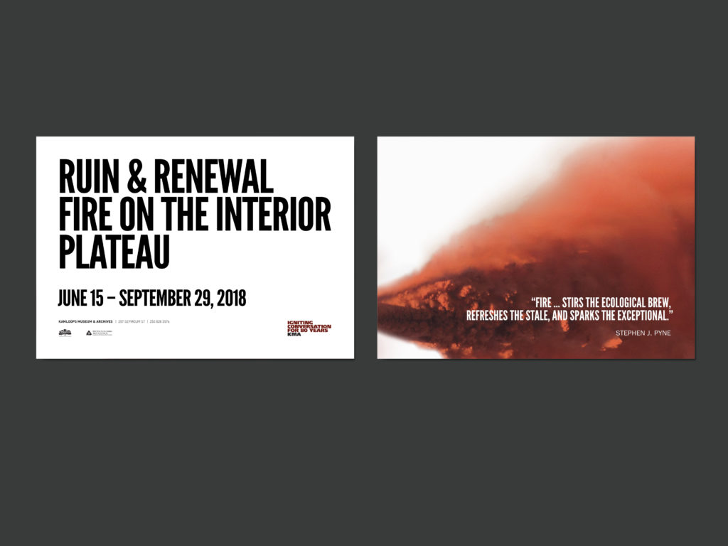
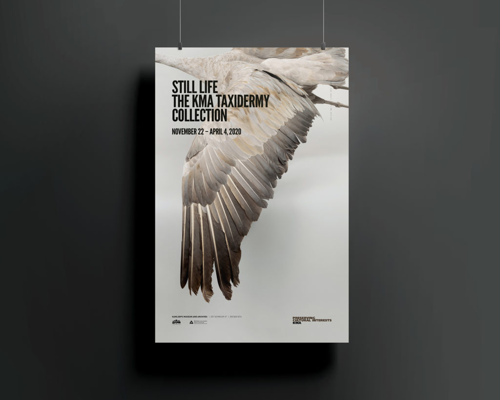
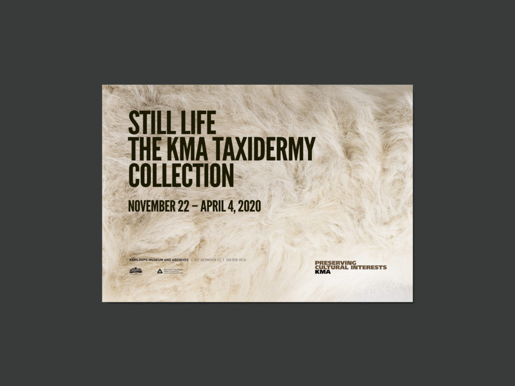
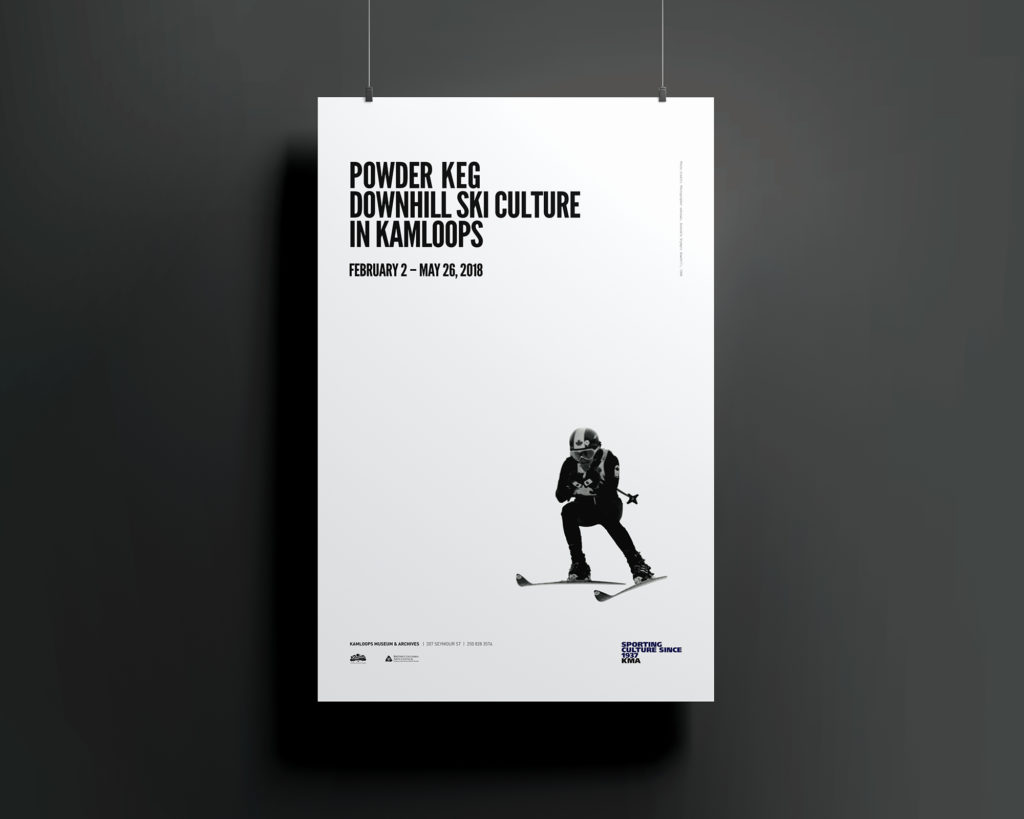
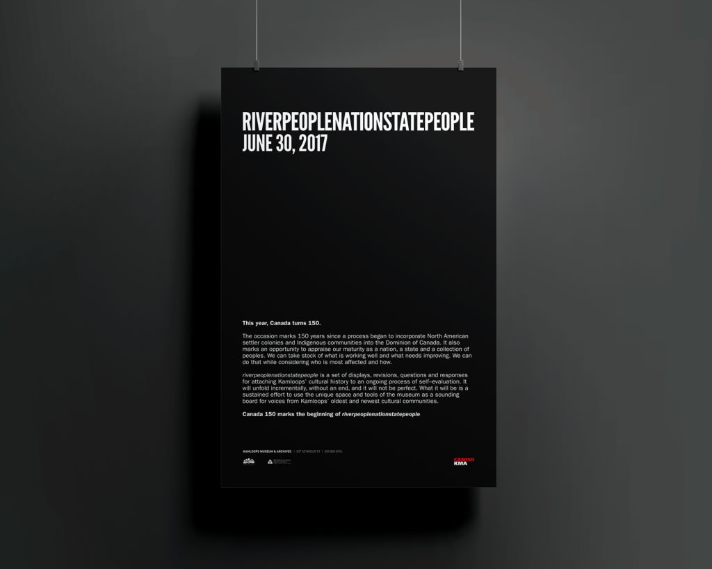
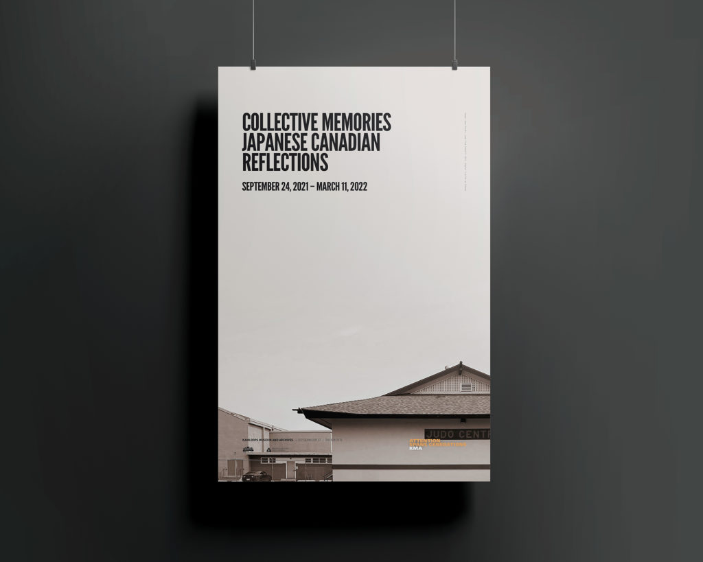
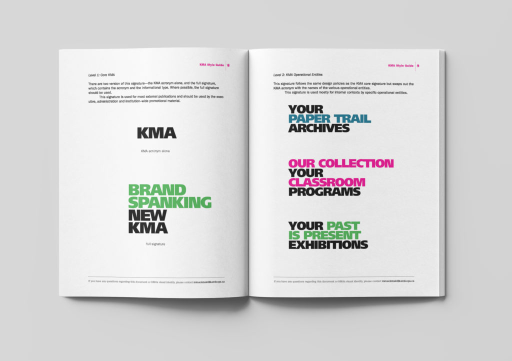
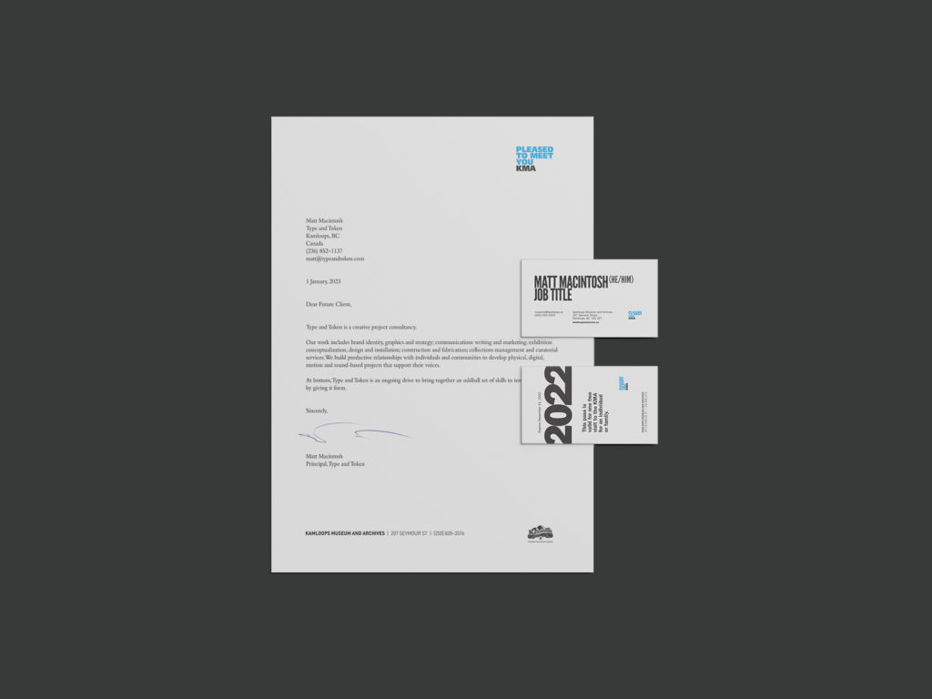
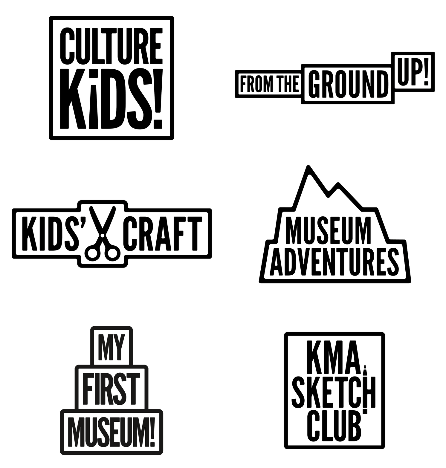
A dynamic signature, programming and other graphic assets link together to convey a unified, adaptable and spacious theme. The use of bold type and imagery is meant to undo traditional impressions of the regional heritage museum and make room for new voices to tell their cultural stories.
More photographs: Kamloops Museum and Archives
Print collateral mockups: Anthony Boyd Graphics
